Every Friday afternoon, Washington time, the Commodity Futures Trading Commission publishes something no price chart can give you: a register of how the largest players in the futures market are actually positioned. Not what they say in interviews, not what a sentiment survey claims, but the real long and short contracts they held as of Tuesday, reported under legal obligation. It is the closest thing retail traders have to seeing the order book of institutional conviction.
Used well, the Commitments of Traders report answers questions that drive every serious trading decision. Is this rally backed by fresh institutional money, or is it running on fumes? Is the crowd so stretched on one side that the trade has become a liability? Are the hedgers, the people who handle the physical commodity for a living, quietly taking the other side? Used badly, COT becomes a contrarian horoscope that tells you to fade every trend two months early. The difference between the two is method, and that is what this guide is about: what the data actually measures, how the COT suite in the terminal processes it, and five specific playbooks for putting it to work without hurting yourself.
What the COT report actually is
The CFTC requires every trader whose position exceeds a reporting threshold to declare it. Once a week the agency aggregates those declarations per futures market and publishes the totals. The snapshot is taken every Tuesday at the close; the report is released on Friday at 3:30 p.m. Eastern. That three-day lag matters and we will come back to it.
The terminal ingests the report directly from the CFTC's public reporting API the moment it is out, covering roughly 80 futures markets across seven groups: forex, metals, energy, agriculture, equity indices, bonds and rates, and crypto. The data is cached and refreshed on the weekly cycle, and the COT page shows both the latest release date and the next scheduled one, so you always know how fresh the snapshot is.
The three groups, and which one you should care about
The legacy COT report splits every market's open interest into three buckets. Understanding who is in each bucket is the whole game, because the same data point means opposite things depending on whose hands it describes.
| Group | Who they are | How to read them |
|---|---|---|
| Commercials | Producers, processors and merchants hedging physical exposure: the airline hedging jet fuel, the miner selling forward gold, the food conglomerate buying wheat. | Value-driven and usually positioned against the trend. They accumulate into weakness and sell into strength, because for them futures are insurance, not speculation. Persistently smart at extremes, persistently early everywhere else. |
| Large speculators | Hedge funds, CTAs and managed money: the "non-commercials." They hold positions to profit from price movement. | Trend-driven. Their net position tracks and amplifies the prevailing move. They are right in the middle of trends and wrong at turning points, which is exactly what makes their positioning measurable fuel. |
| Non-reportables | Everyone too small to hit the reporting threshold, mostly retail. | Noise for most purposes. Occasionally useful as a contrarian flag when this group is heavily loaded on one side. |
The terminal's COT page is built around the speculator category. Spec Net on every gauge and table row is large-speculator longs minus shorts; Comm Net, the commercial equivalent, sits one column over. The two are near mirror images by construction, since someone has to take the other side, but the divergences between them at extremes are among the most useful signals in the dataset.
Why positioning moves price
COT analysis rests on one mechanical insight: a futures position, once open, must eventually be closed. When large speculators are net long crude oil to a degree rarely seen in the past year, two things are simultaneously true. First, the institutional money agrees with the uptrend, which is genuine information. Second, an enormous block of future selling now hangs over the market, because every one of those longs will at some point be liquidated. As long as fresh buyers keep arriving, the position keeps growing and the trend keeps running. The moment the inflow stalls, the exit becomes the trade.
This is why positioning data has a dual character that confuses newcomers. A rising spec net is trend-confirming in the middle of the range and trend-threatening at the extreme. The skill is not in reading the number; it is in knowing which regime you are in. That is precisely what the terminal's percentile machinery is for.
Reading the COT page in the terminal, element by element
Open the COT Report Analysis page in the terminal and you get four layers, ordered from fastest read to deepest. Here is what each one computes and how to interpret it.
1. The release clock and summary row
The stat cards along the top show how many instruments are tracked, how many are net long versus net short on the speculative side, how many sit at positioning extremes right now, and the latest plus next release dates. Two seconds here calibrates the whole session: a market where 70% of tracked contracts are spec net long is a market leaning hard in one direction, and worth knowing before you add another long to the pile.
2. The extremes strip
Directly below sits a row of chips flagging every instrument whose current speculative net position ranks in the top or bottom 10% of its own 52-week history. The terminal computes a percentile for each market: a P95 chip means specs are more heavily positioned long than in 95% of the past year's weeks, and the chip reads EXTREME LONG; a P5 reads EXTREME SHORT. This strip is your watchlist generator. Nothing on it is a trade by itself, but everything on it deserves a chart open and an alert set, because these are the markets where the fuel argument is live.
3. The gauges
Each tracked instrument gets a card with the speculative net position, the change since last week, a long/short balance bar, and a plain-language positioning label. The label is driven by net position as a share of open interest: beyond plus or minus 10% of open interest reads Bullish or Bearish, beyond 25% reads Very Bullish or Very Bearish. Below that, three analytics earn the card its place:
- The 52-week percentile track. A dot on a red-to-green scale showing where today's net position sits in the past year's range. This is the single most information-dense pixel on the page: P50 means unremarkable, P88 means stretched, P97 means the theatre is full.
- The 4-week trend. Reads RISING when the net position has moved up more than 10% over the past month, FALLING when it has moved down by the same, stable in between. A trend tag pointing in the same direction as the crowd's extreme means they are still pressing; a tag that goes quiet or turns against the extreme is the early sound of the exit.
- The 12-week sparkline. The shape of the position's recent path: steady climb, plateau, or rollover. A plateau at a 52-week high is a very different animal from a climb through the middle of the range.
4. The detail table and the history modal
The table below the gauges adds the columns professionals actually compare: speculative longs and shorts separately, the week-over-week change, net position as a percentage of open interest, commercial net, total open interest, and an extremity score from 0 to 100 that scales with how large the speculative bet is relative to the size of the whole market (anything above 70 is flagged). Click any instrument and a modal opens the full positioning history with the price-relevant statistics and a chart that goes back not weeks but decades, up to roughly thirty years for the major contracts. That long history is what separates a genuine generational extreme from a number that merely looks big against a quiet year.
A 100,000-contract net long means one thing in crude oil, where open interest runs into the millions, and something entirely different in a thin agricultural market. Dividing by open interest normalizes the bet to the size of the arena, which is what makes positioning comparable across markets and across time. When you scan the table, sort by % of OI or by the extremity score, not by raw contracts. The raw number rewards big markets; the normalized number reveals crowded ones.
This week's tape: reading the real numbers
Theory is cheap, so let us read the actual screen. Everything below comes from the report dated Tuesday, June 2, released Friday, June 5, exactly as the terminal displayed it while this article was being written; the next update lands Friday, June 12. The summary row counts 68 tracked contracts, split 36 net long against 32 net short on the speculative side, and the extremes strip is unusually loud:
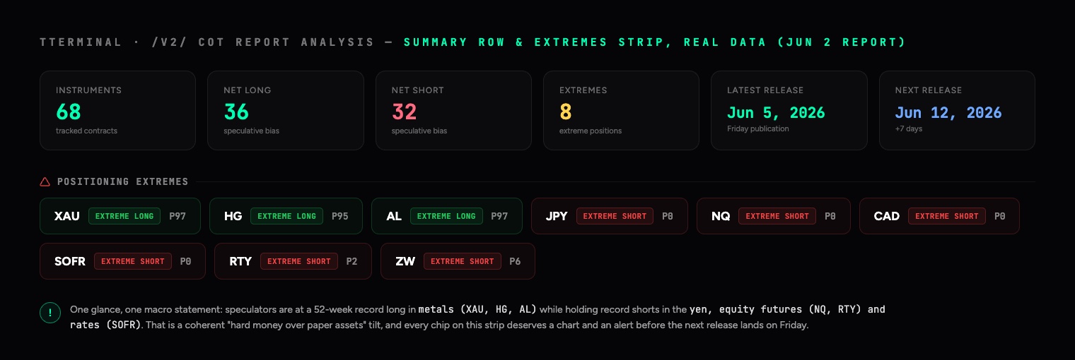
Read the strip as one sentence and it is already a macro statement: speculators hold 52-week record longs in metals (gold P97, copper P95, aluminum P97) and 52-week record shorts in the yen, Nasdaq and Russell futures, and SOFR rate contracts. That is a coherent hard-assets-over-paper-assets tilt across the whole board. Now the individual reads, and what a desk actually does with each one.
Gold: what a crowded long looks like
Gold's row this week: spec net +171,417 contracts, up +21,757 on the week. Longs 202,178 against shorts 30,761, which is six and a half longs for every short. The net position equals 39.4% of open interest, deep past the 25% line, so the label reads Very Bullish and the extremity score sits at 78.8, comfortably above the 70 flag. Percentile: P97.2, EXTREME LONG, and the 4-week trend still reads RISING. On the other side, commercials are short 202,504 net.
What to do with that: nothing heroic. If you are long gold, the trend is intact and the crowd is still pressing, but you are late-cycle on fuel: tighten the stop, stop adding, and let the position breathe. If you are hunting the fade, the precondition is met but the trigger is absent, because RISING means the unwind has not begun. The single number to watch next Friday is the weekly change: after a +21.7K week at P97, the first negative print is the first crack in the wall.
The yen: extreme, still pressing, and a divergence underneath
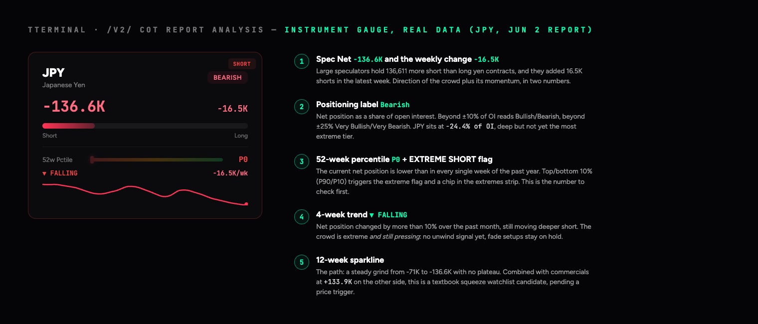
The yen is the mirror image. Spec net -136,611, percentile P0: more short than in every single week of the past year. The position equals -24.4% of open interest, the trend reads FALLING and the crowd added another 16.5K shorts last week; the sparkline is a twelve-week staircase from -71K down to -136K without a single plateau. Underneath it, commercials hold +133,897 net long, absorbing everything the funds sell.
The discipline here: P0 alone is not a buy signal, and FALLING tells you the pressing has not stopped, so knife-catching is forbidden. But the configuration, record crowd short against a heavy commercial long, is exactly how squeezes are born, and yen short-covering rallies are historically violent. The correct move is not an order, it is a watchlist entry: define the price trigger (for instance a weekly close against the downtrend) and let the next two weekly reports tell you whether the trend tag goes quiet. Extreme plus divergence plus trigger is Playbook 3; two of three are now in place.
Three reports in a row: how to read the change, not the level
A single COT row is a snapshot. The edge is in the film, the sequence of weekly releases, because the change tells you something the level never can: whether a move is driven by new money taking a side, or by the other side giving up. Those look identical in the net number and mean opposite things. Here are the yen's last three reports exactly as they landed, with the deltas the terminal lets you read off the weekly-change column and the open-interest column.
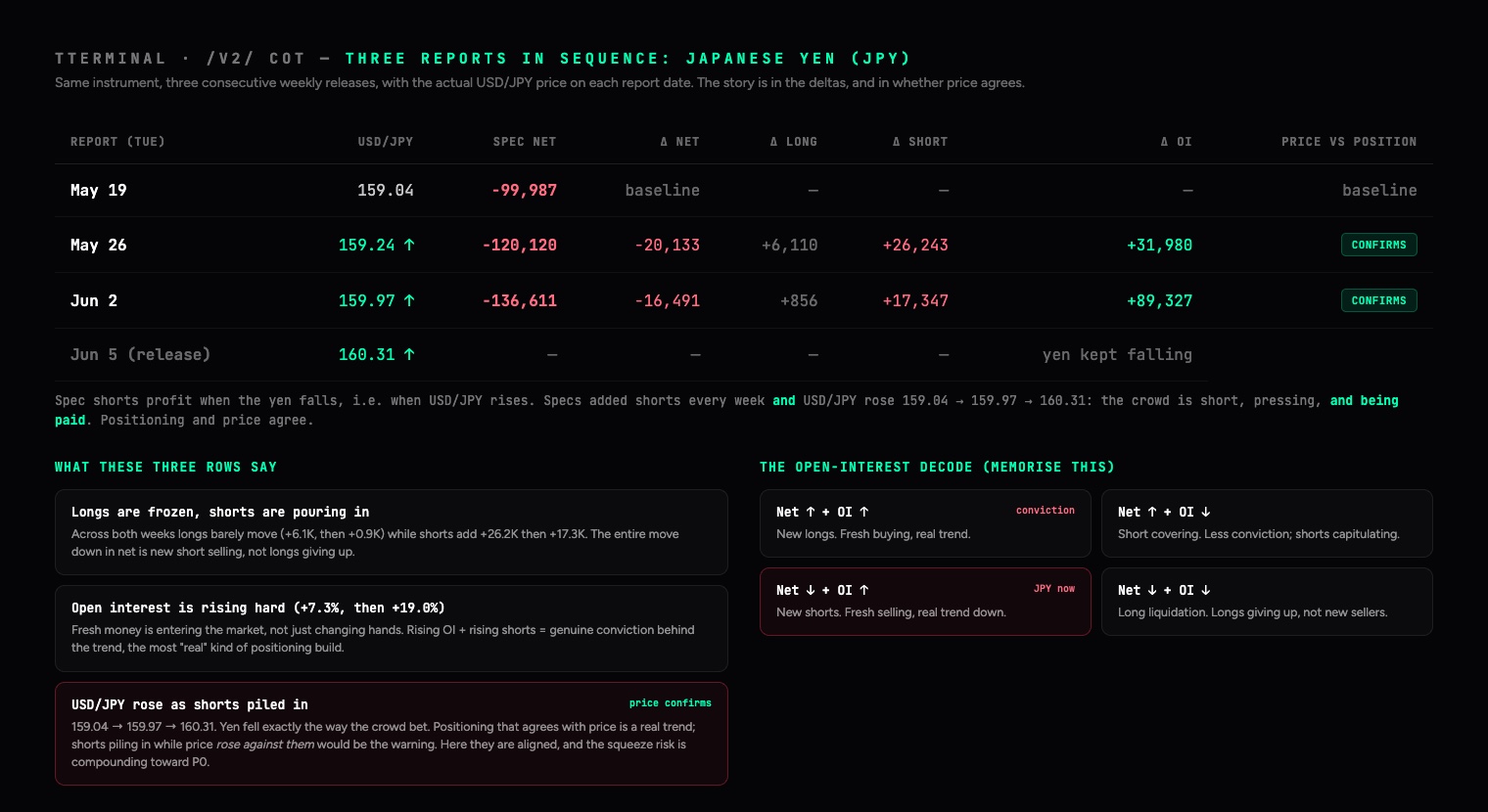
Walk it week by week. From May 19 to May 26 the net fell by 20,133, but look how: longs rose 6,110, shorts jumped 26,243, and total open interest climbed 31,980, up 7.3%. The week after, net fell another 16,491 with longs essentially frozen (+856), shorts up 17,347, and open interest exploding 89,327, up 19%. The same pattern twice: longs are not leaving, fresh shorts are arriving, and the market as a whole is growing. That is the signature of a conviction trend, not an exhausted one.
Now the half that makes it actionable: what did price actually do? A yen short profits when the yen falls, which means when USD/JPY rises. Pull the chart for those exact dates and USD/JPY closed at 159.04 on May 19, 159.24 on May 26, 159.97 on June 2, and kept climbing to 160.31 by the Friday release. The yen weakened, steadily, in precisely the direction the crowd was betting. Positioning and price agree, and that is the distinction that matters: a crowd piling into shorts while price falls against them (yen strengthening) would be specs fighting the tape, an early warning that the consensus is wrong and a squeeze is overdue. Here the opposite is true. The shorts are not just numerous and growing, they are being paid, which both validates the down-trend and quietly loads the spring for the eventual unwind. Always read the three positioning reports next to the price over the same three weeks; positioning that confirms price is a trend, positioning that contradicts it is a warning.
The tool that disambiguates this is open interest, and it is the most under-used column on the page. Pair the direction of net positioning with the direction of OI and you get four distinct situations, only two of which look alike on the surface:
| Net direction | Open interest | What is actually happening | Conviction |
|---|---|---|---|
| Net rising (more long) | OI rising | New longs entering. Fresh buying. | High, trend confirmed |
| Net rising (more long) | OI falling | Shorts covering. The down-crowd is capitulating, not new bulls arriving. | Low, move may fade |
| Net falling (more short) | OI rising | New shorts entering. Fresh selling. This is the yen now. | High, trend confirmed |
| Net falling (more short) | OI falling | Longs liquidating. The up-crowd is giving up, not new bears arriving. | Low, move may fade |
This is why two markets can both print "spec net more bearish this week" and mean opposite things. New shorts with rising OI is a trend you respect; long liquidation with falling OI is often a trend in its last gasp, with nobody left to sell. The terminal gives you both halves, the weekly change on the gauge and open interest in the detail table, so reading three reports in a row is just watching whether the longs or the shorts are the ones moving, and whether the whole market is growing or shrinking around them.
The same three-report lens turns each playbook from a snapshot into a trigger. Playbook 1 (the fade) goes live not when an extreme appears, but when the sequence shows the build stopping: a P95 long whose net stops rising and whose OI starts falling is short-covering fuel draining away, the first crack. Playbook 2 (riding the build) is confirmed when three reports show net and OI rising together. Playbook 4 (the flip) is unmistakable across three rows when a net crosses zero and OI expands on the new side. The level tells you where you are; only the sequence tells you which way the pressure is moving.
The euro: a flip in progress, and why two metrics disagree
The euro card is quietly teaching the subtlest lesson on the page right now. The net position, +15,729, looks like nothing. But the weekly change is +19,485, larger than the entire net position, which means specs were net short 3,756 contracts the week before. The position crossed zero this week: a flip, Playbook 4 in real time. Meanwhile the percentile says P88.5, knocking on the extreme zone, while % of OI says a mere 1.6% and the label reads Neutral with an extremity of 3.2.
The two metrics disagree because they measure different things. The percentile compares the euro against its own depressed year, where even a small net long ranks high. The % of OI compares it against the sheer size of the market, 980,409 contracts of open interest, which dwarfs 15.7K net. Resolution: this is a fresh, uncrowded long cycle that may just be starting, not a crowded trade, and there is room to run. This single row is why you never act on one number alone, and why the gauge shows both.
Crude and the 10-year note: the no-trade and the macro tell
WTI's net long of +235,397 sounds enormous until you normalize it: 8.5% of a 2.76-million-contract market, percentile P34.6, trend drifting lower. Mid-range on every lens, which means COT has no opinion on crude this week, and the correct positioning trade is no trade. Skipping a market with a clear conscience is also a use of the data.
The 10-year note is the opposite: it looks like a screaming signal, -811,461 net short, -12.5% of OI, commercials long over 806K, percentile 10.9. Before you read it as "everyone is betting on higher yields," apply the asset-class caveat below: a substantial share of leveraged-fund Treasury shorts is the cash-futures basis trade, an arbitrage position, not a rate view. As a directional signal this number is diluted; as a stress gauge, what unwinds violently if funding wobbles, it is exactly the figure macro desks keep on screen.
Which numbers to check, in which order
When the page opens, this is the read sequence, with the thresholds the terminal itself uses:
| Order | Metric, and where it lives | Levels that matter | The question it answers |
|---|---|---|---|
| 1 | 52-week percentile (gauge, extremes strip) | P90+/P10- is the extreme zone; 70 to 90 and 10 to 30 stretched; 30 to 70 is the dead zone | Is positioning even a factor in this market this week? |
| 2 | 4-week trend tag (gauge) | RISING / FALLING = the net moved more than 10% in four weeks | Is the crowd still pressing, or stalling? |
| 3 | % of OI and extremity score (table) | Beyond ±10% reads Bullish/Bearish, beyond ±25% Very; extremity above 70 is flagged | How crowded is the trade relative to the size of the market? |
| 4 | Weekly change against the net (gauge, table) | A change above roughly 15 to 20% of the net is a momentum week; a sign flip is a regime event | What just changed, and how hard? |
| 5 | Comm Net against Spec Net (table) | Opposing extremes between the two groups | Are the hedgers leaning against the crowd? |
| 6 | Long history (instrument modal) | Compare against 2 to 10 years, not just 52 weeks | Generational extreme, or merely a loud year? |
And the matrix those numbers compress into, with this week's live examples in their cells:
| Configuration | Read | Action |
|---|---|---|
| P90+ and RISING | Crowded and still pressing (gold now) | No fresh longs without tight risk; no fade either; watch the weekly change for the first crack |
| P90+ and stable or FALLING | The unwind may be starting | Playbook 1 goes live: arm price triggers against the crowd |
| P30 to 70 and RISING | Accumulation with room (the euro now) | Playbook 2: trade with the build, buy pullbacks |
| P30 to 70, flat trend | No positioning signal (crude now) | Move on; COT is silent here |
| P10- and FALLING | Crowded short, still pressing (the yen now) | No knife-catching; build the squeeze watchlist with defined triggers |
| P10- and stable or RISING, with commercial divergence | Squeeze setup maturing | Playbook 3: trade the reversal the moment price confirms |
The same number means different things in different markets
One threshold table does not fit all asset classes, because the structural players differ. The desk adjustments:
- FX. Every contract is quoted against the dollar, so a net long euro is also a net short dollar bet. Always cross-check related pairs and the Dollar Index for consistency; contradictions between them resolve violently. The yen deserves special attention: as the world's funding currency its positioning extremes have the most reliable squeeze history on the entire board.
- Gold and metals. Commercials are miners and refiners hedging future production, so the commercial side is structurally net short. A large comm short in gold is the baseline, not a bear signal; what carries information is its change. Speculative % of OI runs structurally high in gold, and metal extremes persist longer than in any other group. Be patient with Playbook 1 here.
- Energy. Speculators have been net long crude for most of recorded history, so the zero line means little. The percentile is the only honest lens, and the energy category is where seasonality (driving season, winter gas) most often explains what looks like a positioning anomaly.
- Equity indices. The legacy report's spec net in index futures is polluted by dealer hedging and structured-product flows, which makes mid-range readings noisy. Respect only the hard extremes: this week's Nasdaq at P0 and Russell at P2 qualify; a P60 in the S&P does not.
- Bonds and rates. The famous caveat: leveraged funds run enormous Treasury shorts as the cash-futures basis trade, an arbitrage against the bond they own, not a bet on yields. Read rate-market positioning as a consensus-and-stress gauge rather than a clean directional signal.
- Crypto. Bitcoin futures open interest at the CME runs around 20K contracts, a rounding error next to FX or rates. A single desk can move the number, so demand confluence with the larger markets before trusting any crypto chip on the strip.
Five playbooks the desk actually uses
Playbook 1: the extreme fade, with a trigger
The classic COT trade. An instrument hits the extremes strip at P95+ or P5-, positioning has stopped expanding (the 4-week trend tag goes quiet or turns against the extreme), and price then breaks a technical level against the crowd. That last clause is everything. Positioning extremes are a precondition, not a signal: markets can sit at P95 for two months while the trend grinds on, and fading it on day one is how COT gets its bad reputation. The sequence that works is extreme, then stall, then price trigger. The COT data tells you where the powder keg is; the chart tells you when the fuse is lit. Size the trade knowing you are early by design, and let the unwind of the crowded side do the heavy lifting once it starts.
Playbook 2: ride the build
COT is wrongly pigeonholed as a pure contrarian tool. In the middle of the range it is a trend confirmation engine. When a market you like fundamentally shows spec net RISING through the 40th to 70th percentile band, institutional money is arriving and there is still room before crowding becomes a concern. That configuration argues for buying pullbacks rather than fading strength, and for holding the position while the weekly updates keep confirming accumulation. The position becomes suspect only as the percentile pushes into the 90s while the weekly inflow decelerates: fuel filling up, inflow slowing, classic late-trend signature.
Playbook 3: commercial divergence at the turn
At genuine turning points the two big groups tell opposite stories, and the commercials have the better long-term record at extremes. The pattern to hunt: speculators at a 52-week positioning extreme while commercials lean unusually hard the other way. The people who produce and consume the commodity are willingly absorbing everything the funds are selling, or distributing everything the funds are buying. They are early, always, but when this divergence appears at a multi-year price level and the spec position then starts unwinding (the trend tag turning against the extreme), the probability of a durable turn rises sharply. Check the Comm Net column against Spec Net in the detail table, then open the history modal to judge how rare the current spread between them actually is.
Playbook 4: the flip
The sign change in spec net, from net short to net long or back, is an underrated regime marker. It means the directional consensus of fast money has inverted. Flips out of a long-held extreme are the strongest version: when a position that spent a year net short crosses zero, short-covering has run its course and a fresh long cycle often begins, with the percentile machinery resetting around the new regime. The 12-week sparkline makes flips easy to spot, and the weekly change column tells you whether the crossing has momentum behind it or is just drift around zero.
Playbook 5: cross-market confirmation
Positioning is a web, not a list. The euro, the Dollar Index, gold and the 10-year note all express views on the same dollar-and-rates complex, and their COT readings should rhyme. Specs heavily long EUR while also heavily long DXY is a contradiction; one of those crowds is wrong, and the resolution is usually violent. Conversely, when an extreme in one market is echoed by consistent extremes in its neighbours, the signal carries more weight. Use the category tabs to read forex, bonds and metals as a single macro statement, and treat internal contradictions as volatility warnings.
The weekly routine
COT is weekly data and rewards a weekly process. The release lands Friday evening European time, which makes the weekend the natural review window, away from live-market noise.
- Friday or Saturday: scan the extremes strip and the summary row. Note new arrivals to the strip and any instrument whose 4-week trend flipped. Ten minutes.
- Sunday: for each market you trade, check the percentile, the trend and the weekly change. Cross-reference against your existing positions: are you long something the entire speculative community is already maximally long? That is not a reason to exit, but it is a reason to tighten the stop and stop adding.
- Monday: set the week's alerts on the markets flagged at extremes, at the technical levels that would constitute a trigger. The COT homework defines where to pay attention; the week's price action decides whether anything happens.
What COT will not do for you
An honest tool description includes the failure modes, and COT has well-known ones.
- It is three days old on arrival. The Friday release describes Tuesday's book. In calm regimes that barely matters; in fast markets a position can be materially different by the time you read it. Treat COT as structure, never as a timing instrument.
- Extremes can persist for months. P95 is a description, not a countdown. Strong trends routinely hold extreme positioning far longer than a fading trader stays solvent. Hence the trigger discipline in Playbook 1.
- It covers futures, not the whole market. FX especially trades mostly over the counter; futures positioning is a proxy for the speculative slice, not a census of all flows. The proxy has decades of evidence behind it, but it is a proxy.
- It will not size or manage your trade. Positioning context changes the prior probability of continuation versus reversal. Entries, stops and risk per trade remain entirely your job.
Common mistakes that cost real money
- Fading an extreme on day one. The most expensive habit in positioning analysis. Gold at P97 with a RISING tag can go to P99 and stay there for a quarter while price climbs another ten percent. Extreme means watch, not sell.
- Comparing raw contracts across markets. This week's tape is the proof: crude's +235K net is a no-signal at 8.5% of OI, while silver's far smaller +24K is a meaningful 20.1% of its market. Without normalization the table lies to you.
- Reading commercial shorts in producer markets as bearish. Miners are always short gold futures; that is what hedging production means. The commercial sign is structural, its change is the signal.
- Forgetting what happened between Tuesday and Friday. The report you read on Friday predates Wednesday's CPI or an FOMC decision. After a major mid-week event, treat the data as a "before" photograph and wait for the next release to see the reaction.
- Re-reading the same number all week. COT updates once per week. If you find yourself re-deriving conviction from the same stale print on Thursday, you are using a weekly structural tool as a daily signal generator, and it was never built for that.
Percentile: is the market mid-range or extreme? Trend: RISING, stable, or FALLING, and is it with or against the extreme? Normalization: how large is the bet as % of open interest, and what is the extremity score? Divergence: what are the commercials doing? History: how rare is this configuration in the long-term modal view? Trigger: has price actually confirmed, or am I about to fade a trend on positioning alone?
The takeaway
The COT report is the rare dataset that is simultaneously free, regulatory-grade and genuinely moving markets, and most traders still either ignore it or misuse it as a pure fade signal. The middle path is where the edge lives: read speculative positioning as fuel, use percentiles instead of raw numbers, demand a price trigger before trading against the crowd, respect the commercials at extremes, and run the analysis on a weekly rhythm that matches the data. The terminal does the heavy computation, the percentiles, the trends, the extremity scoring and the decades of history, every Friday the moment the CFTC publishes. What it cannot automate is the discipline. That part has always been the trader's edge, with or without the data.
COT data referenced in this article comes from the CFTC's public Commitments of Traders reports as processed by the TTerminal COT suite. Examples are illustrative of method, not recommendations on any market. This article is TTerminal's own educational analysis and is not investment advice.
Read positioning like the institutions.
The full COT suite, 52-week percentiles, extremes, commercial divergence and decades of history, live in the terminal across forex, metals, energy, indices, bonds and crypto.
Start 7-day free trial ↗